In early days of consumer AR & VR app development, we’re seeing lots of experimentation with UI and mechanics. We saw the same thing in early days of smartphone apps, including several misfires before truly native thinking took hold.
As part of this evolution, we already see signs of usage behavior that can inform developers. For example, Google recently released data around consumer VR consumption patterns, indicating that session lengths are much longer than mobile apps. The takeaway: design for that reality.
Longer VR sessions stand to reason, as immersion compels sustained periods of play to build up a true sense of presence. That presence can’t be achieved in the short bursts with which we associate mobile apps — things like checking email, news, social updates or scores.

Snack Time
At the time of that Google data release, we wrote “VR is a Meal, Not a Snack.” Now we’d like to add to that construct, bringing in AR’s relative position in this experiential spectrum. It’s becoming clear from mobile AR’s nuances that it is, in fact, the snack in this equation.
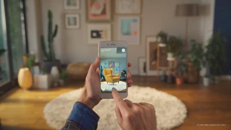
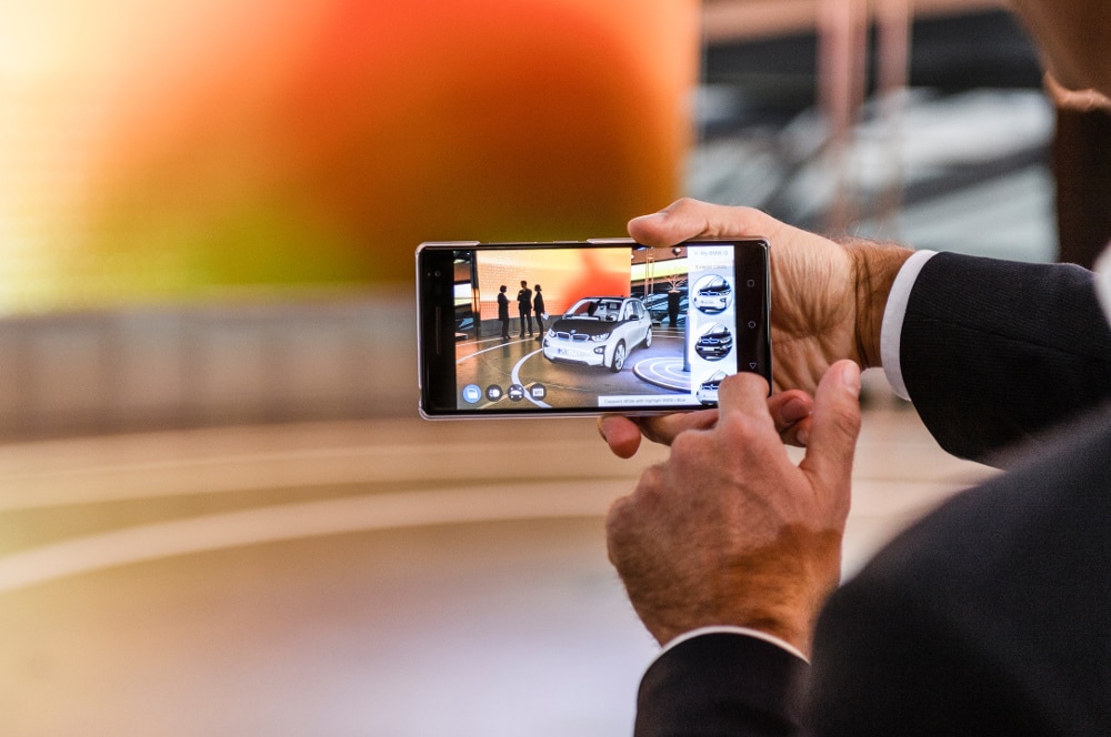
This has a lot to do with mobile AR’s drawbacks as well as its strengths. For example, the need to hold up a smartphone to experience mobile AR precludes long session lengths with extended arms. That burdens users with tired arms, dangerous (distracted) situations, or just a bad look.
“I can tell you from experience that people don’t do this,” Niantic CTO Phil Keslin said on stage at TechCrunch Disrupt last month. “It’s very unnatural. It makes them look like a total doofus if they’re doing it for an extended period of time.”
Pokemon Go CTO says people do not like pointing their phones for AR.
"No one walks around like this"#TCDisrupt pic.twitter.com/dvwgii2zzD
— TechCrunch (@TechCrunch) September 19, 2017
Other hardware realities likewise compel experiences that live in short bursts. We’re talking battery life and heat issues from longer AR sessions. If you’ve played with ARkit apps, you may have felt this first hand. Killing users’ batteries isn’t a good product strategy.
“AR on iPhones makes the phone hot, and kills the battery quickly,” Transformation Group Partner Robert Scoble said in a recent training session. “So we believe consumers are only going to want to use AR for a few minutes at a time, not go into something that’s an hour.”
Keslin and Scoble both advise designing app mechanics that only require holding the phone up for short segments within the overall experience. Snapchat and Pokemon Go are exemplars, with most of the AR value derived from media capture that happens rather quickly.
“In Pokémon Go, the only time they really use it is to share their encounter with the Pokémon,” said Keslin. “To take that one picture is natural….Everybody takes a picture, and then they’re done. It’s not walking around the world with the phone in front of their face.”

Same Game, Different Players
The main point is that form factor should drive developers’ design decisions for mobile AR apps. That will continue to be a moving target as we learn about user behavior, but we’re seeing lessons already. And like with smartphone app tactics, the playbook will evolve rapidly.
Of course all of the above speaks to consumer mobile AR, but the concept of designing for the form factor applies broadly. As discussed recently with Lumus, AR glasses developers (consumer and enterprise) should follow this principle, albeit different factors. Perhaps it will be a buffet.
When that day arrives, consumer AR glasses’ usage patterns will become evident. Some will be expected, while others may surprise us. Then we’ll see this discovery process all over again. The good news is that shifts like this create gaps for new players and innovations to emerge.
For a deeper dive on AR & VR insights, see ARtillry’s new intelligence subscription, and sign up for the free ARtillry Weekly newsletter.
Disclosure: ARtillry has no financial stake in the companies mentioned in this post, nor received payment for its production. Disclosure and ethics policy can be seen here.
Header image credit: IKEA
