Film trailers aren’t built in a day. But before I get stuck into the details, let me briefly introduce myself.
I’m Ellenor, an Aussie at heart, but LA has been home for quite some time now. Directing and producing is my jam, and I proudly co-run Mermaid Toast, a female-driven production agency. With 15 years in commercials and shorts, I’m now juggling prepping a variety of long-form projects with the 400-odd cups of coffee I had during the making of the trailer, Echoes of Sand and Stone. Creativity needs fuel.
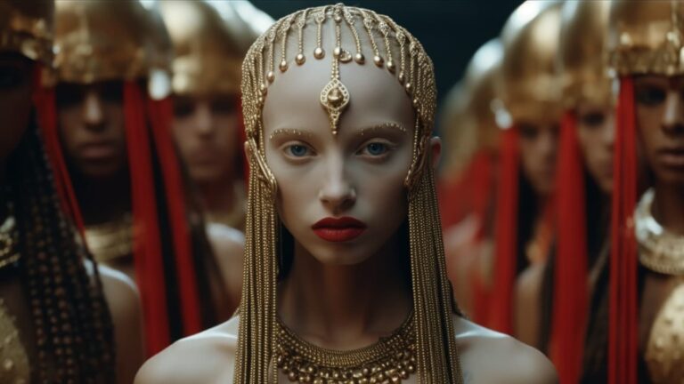
The idea for this trailer came from spending the past 8+ months conceptualizing a future ancient and Egyptian world in Midjourney. From there I started sharing images on Instagram; and then as an exercise, building short stories about each of the characters I created.
Before I got to the trailer, I had a whole story synopsis and outline formed. It was important to get the most cinematic results possible, so let’s talk about how I got there. In making the trailer, I went back and forth, tweaked, replaced, and sometimes, even started from scratch.
World Building
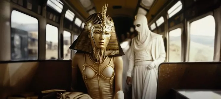
Every world has rules, cultures, and backstories. I started by visualizing images I loved, then creating key scenes and drama around them. You’ll notice in the trailer there is a car scene; I built rules around this game and characters with stakes to go with it.
Color palette: I liked reds, whites, blues, and gold. If I’m building a futuristic world based on ancient Greek and Egyptian culture, these are the key colors. I am also a MASSIVE Roger Deakins fan, so volumetric lighting features heavily in my generative-AI prompts. This color palette and theme gave me consistency.
To add depth, repeated motifs or symbols can also have a powerful impact, so I made sure to spend time creating rules, gods, and tribes for my people to exist in and around. This, in turn, made it easier for me to come up with a storyline that would feature in this trailer and showcase shots where some of those themes would repeat subtly.
The key to world-building is all of the little details that make it authentic. I removed a lot of things I didn’t want in Photoshop, and sometimes I’d toggle between a 16:9 aspect ratio in my Midjourney prompts or let them be square in older models (I used older versions because I often liked their results in MY world better) and extended the scene in Photoshop to my liking.
Tip: With advancing tech like Midjourney, sometimes it feels too detailed. Toggle between versions to strike a balance between vibes in your world.

Research and Inspo
Before I began cutting my teaser trailer, I had THOUSANDS of images to pull from. So, how to structure it all? Start with research. I began by studying trailers from classic and modern movies, observing their flow, rhythm, and tone. Watching numerous trailers to understand pacing, thematic elements, and transitions. For me, my film’s references were Metropolis, Stargate, The Mummy, Hunger Games, Dune, and Black Panther. Not every scene has to be elaborate. Sometimes, less is more, and many of my shots ended up on the cutting room floor.
Tip: Watch trailers in mute. This helps in understanding the visual narrative and its cutting points.
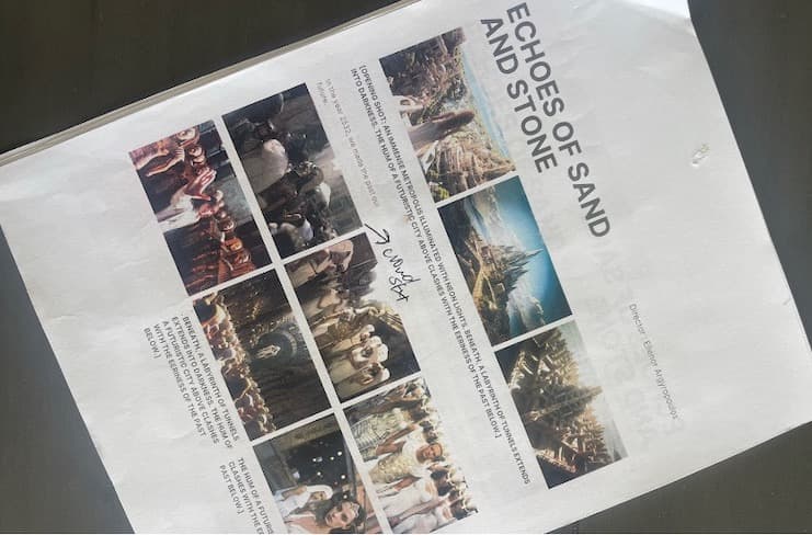
Storyboard
Instead of just randomly putting shots together, I storyboarded. I did this for three reasons:
- I have SO MANY IMAGES I needed to find the best structure to make it all make sense,
- Because I wanted this trailer to be the best it could be, and
- Because I am actually releasing another trailer with more detail on the story structure, understanding where that would go versus this one was very important.
The storyboard was my puzzle board. I laid them out, shuffling and reshuffling, spotting gaps in and creating narrative to fill.

To bridge these gaps and to gain perspective, I turned back to the cinematic giants I mentioned before – trailers like Dune, The Mummy, and The Hunger Games. These masterpieces helped me gauge the pace, stakes, and crescendoing drama I aimed for. Cross-referencing these trailers, I could identify where my narrative needed heightened stakes or changes. Yet, this was not a one-time process. With every alteration, I’d dive back into Midjourney, crafting more scenes, refining the narrative arc, and ensuring that the storyboard didn’t just tell a story but resonated with the audience’s emotions and expectations.
TIP: Divide the trailer into three key segments: 1. Introduce the Universe. 2. Establish the Conflict. 3. Reveal a Glimpse of the Climax.
Movement, Editing & Polishing:
Blend LeiaPix and Gen-2 for a diverse visual experience
Originally, I started by animating images with Leiapix, so the trailer was just going to be a moving photo trailer. But then came July, and Runway got SO GOOD with Gen-2 that I basically had to redo most of my shots that I already did in Leiapix. The result was me blending some images from Leiapix with some images from Gen-2. A combination of both is what gives this trailer diversity.
However, Gen-2 at times can look fake. I watched every single video online to see the results people were getting (yes, every single one) and felt I could make this trailer more cinematic and push it further using a variety of tools.
Enhanced images using tools like Pika Labs, Remini, and Heygen, tweaking them to cinematic perfection.
Pika Labs let me add dynamic prompts to my videos – from moving hair to a train’s steam. But its beta status sometimes delivers fuzzy results. To refine this, I integrated Gen-2 shots. I found that re-rolling would perfect them until I got a video motion I liked, then I blended them with Pika effects.
I’d overlay Pika’s smoke or wind onto my high-res photos, ensuring the final blend was seamless. An example: the cape movement below, layered to retain image clarity.

Deciding whether to upscale became a frequent choice, as it blurred certain imperfections which I wanted to keep and felt very artificial. I upscaled with Remini a lot but found myself constantly making decisions on each image in high-level detail.
Sometimes movement in Gen-2 or Pika Labs would mess up the face, so I’d use Stable diffusion to bring back that information and sharpness, then render out as a series of images which I’d then turn back into a video and then into my timeline! Wew! It’s a process!

Added elements like grain, anamorphic flares, and motion blur for a touch of realism.
Adding imperfections made this more cinematic. It’s why people will put film grain and light leaks into digital, because film was the gold standard (and still is in my opinion, dear movie gods please let me shoot in 70mm one day).
For this trailer, I combined grain, flares, and motion blur, refining details in DaVinci Resolve. When necessary, I utilized Heygen for character expression and matched lighting to ensure a seamless blend with Gen-2 movements.
All of this made it cinematic and realistic, not just animated AI. The design is to make you look twice and go “wait, is that a real person moving? Or not?”.
TIP: Scream at your computer in excitement when you get a clear realistic image…and text your friends pictures of you screaming in excitement since being a bit nerdy about this can be an isolating process.
TIP 2: Since the tech is still a little fake at times, to make it realistic, utilize short, sharp movements. A fast transition can make a 2-second clip feel dynamic and packed with action.
Sound Design
Working on the sound design is extremely important to bring drama and stakes to the piece.
Epic. Ancient. Resounding. That’s the essence I wanted to capture. The heart of the trailer beats with a blend of powerful, epic melodies blended with an ancient touch. But to fine-tune it, I elongated the drum beats and remixed. This added depth and made them resonate like a train, perfectly mirroring the train scenes I was so eager to incorporate.
Tip: Synchronize scenes with music beats to make transitions smoother.
As a filmmaker, AI has been an interesting conversation. For me, I approach it as a tool for the work I want to pitch and create in reality.
Remember, in the digital age, while technology aids us, I hope the guide above shows that it’s the human touch that differentiates and elevates. Let your creativity lead the way. ✌
 Ellenor Argyropoulos is an award-winning director and photographer based in Los Angeles. She is co-founder of Mermaid Toast, a female-driven creative agency working in film & commercial content. Find her on Instagram at @filmenor.

