XR Talks is a weekly series that features the best presentations and educational videos from the XR universe. It includes embedded video, as well as narrative analysis and top takeaways.
How should AR overlays behave? What’s the best way to control them? And how do the interactions change with multi-player AR? These are key questions at this phase of AR, as developers feel their way around to to create compelling UXs… and ultimately killer apps.
It turns out there are rules and best practices developing. Like other software development, it’s about optimizing the UX based on a desired end result. And AR has a set of native design principles based on spatial interaction, which the Google AR team has been discovering.
“An interaction might sound great when you talk about it and it might even look good in a visual mock up.” said Google’s Chris Kelley at Google I/O. “But until you have it in your hand and can feel it and try it, you’re not going to know if it works. You really have to put it in a prototype.”

For example, even though immersive computing like AR is proposed to be more intuitive than interface-heavy technologies that came before it, there will still be a learning curve. Users are conditioned to the interactions and inputs (type, touch, scroll, etc.) of 2D screens.
“We learned that once people learn it, they found it really natural,” said Kelley. But they had to flip a mental switch for expectations they had for how smartphone interaction works. So be mindful of the context and mental models they have from 2D smartphone interactions.”
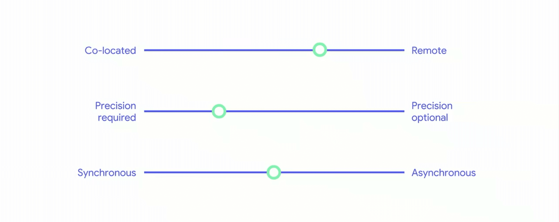
As for design principles, it’s better to think of them as a set of variables that inform optimal tactics, rather than a binary set of rules. Those variable include things like if shared AR experiences need to happen in the same space, or how precise the localization needs to be.
“We see these not as necessarily binary axes but more of a continuum that you can consider when you’re designing these multi-person AR experiences,” said Google’s Elly Nattinger. For example, students in a classroom need spatially precise graphics to all view the same thing.

Conversely, there are situations where two players in the same space compete in a game while side-by-side and looking in the same direction (think: Mario Kart). Both players should see the same graphics, but it doesn’t require spatial precision based on where they’re standing.
Whether the AR is meant to be syncronous (played at the same time) versus asynchronous (media experienced later by a friend) can also steer design decisions. For example, leaving audio or graphical notes in specific locations for friends will be a compelling AR format.
The main point is that successful AR apps will go through this process of vetting of an intended end-user experience. Then it’s about working backwards from there (human first, not engineering first), by making technical and design decisions to hit that target.
“These combinations of space and time and precision are relevant for multi-person AR experiences and they have different technical and experiential needs,” said Nattinger. “Shared AR is a big area, and we’ve explored some parts of it. We’d love to see what you all come up with.”
See the full session below, including an additional segment on spatial audio from Google’s Luca Prasso.
For deeper XR data and intelligence, join ARtillry PRO and subscribe to the free ARtillry Weekly newsletter.
Disclosure: ARtillry has no financial stake in the companies mentioned in this post, nor received payment for its production. Disclosure and ethics policy can be seen here.
