TikTok has a few irons in the fire when it comes to AR. Its most well-known move is its Effect House AR developer platform for mobile AR lenses – basically, its answer to Snap’s Lens Studio. But it’s also one of the relatively few (~1000) companies to develop a Vision Pro app.
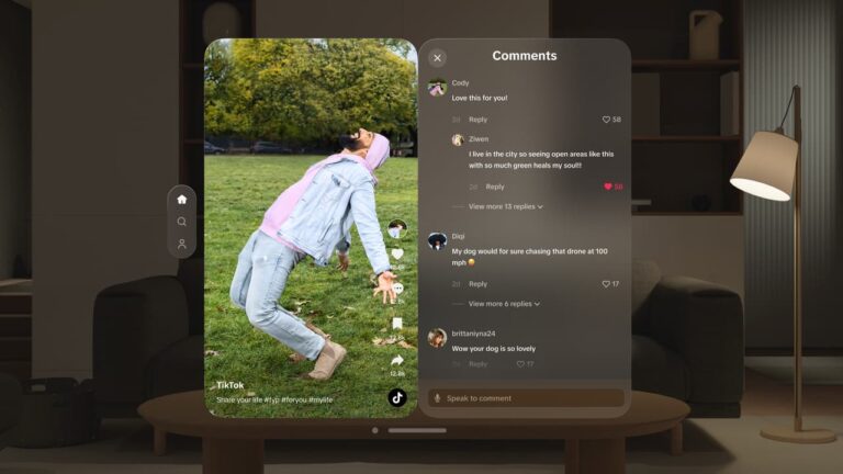
TikTok positions the app as a “reimagined” user experience in order to convey that it’s not just a clone of its mobile app. For argument’s sake, users could already navigate to TikTok through the Vision Pro’s browser. Conversely, TikTok says this app is purpose-built for Vision Pro.
In other words, it’s more immersive. Colors and details pop in the larger-screen format. And you can watch TikTok videos in immersive locations like Yosemite or the moon. That list will grow and likely include customized locations, similar to customized iPhone home screens.
But more important than arguably-gimmicky viewing environments, TikTok’s mobile design challenges go away in the spacious expanses of the Vision Pro. Those mobile UX challenges include comments appearing on top of videos or having to leave a video to jump to a user’s profile.
Elbow Room
With Vision Pro, users can view all these things at once given more elbow room. Navigation buttons and comments are moved to the side to keep the good stuff front & center. Features don’t have to battle for real estate as they do within the zero-sum rectangles that rule our lives.
All the above represents the real opportunity with Vision Pro. Though most punditry has focused on the hardware and the price tag, the more meaningful angle is how developers will translate their existing experiences into native magic on an inherently new spatial platform.
All of this means that early movers can benefit from feeling out Vision OS’ design language and gaining native footing. This was a years-long process in the early days of the iPhone: Early apps were gimmicks and small websites, until they started to strike a native cord.
The latter includes apps that utilize the sensors and unique aspects of the hardware, such as Foursquare (GPS), Snapchat (camera), and Shazam (mic). Those apps hit their stride around 2009 – a year after the app store launched and two years after the iPhone launched.
Head Start
That’s the process we’ll see play out with Vision Pro apps. And that brings us back to TikTok. Is its Vision Pro app native enough? Or is it a gimmicky port of its mobile UX? It seems to strike the former tones, but the jury is still early on what Vision Pro-native means.
Besides native footing, early investments in Vision Pro development could translate to a market-share head start. And that’s a key factor for TikTok as it sits in a hypercompetitive environment, otherwise known as the attention economy. Could its Vision Pro app be a beachhead?
In that sense, the world is divided between companies jumping into Vision Pro and those taking a wait-and-see approach. The latter is arguably more prudent (holdouts including Netflix and YouTube), but the former (Slack, Zoom, and Disney+) could gain an early mover advantage.
For example, does TikTok’s native presence on Vision Pro offer an edge over YouTube? TikTok is increasingly competitive with YouTube so it may see it that way. The answer to this question comes down to Vision Pro’s growth and penetration as a platform, which is still a question mark.

