The latest batch of AR hardware from Google, Meta, and others share a few common standards. For example, they deviate from the AR world’s previous generational flagships (think: Magic Leap) in toning down the visual UX in favor of device style, wearability, and AI-driven utility.
In fact, AI has come along at the right time to displace visuals as AR’s primary selling point. Avoiding rich and dimensional visuals has in turn sidestepped AR’s vexing design dilemmas and enabled a semblance of hardware style. This is what we’ve been calling XR’s reality check.
The reality check principle goes beyond just visuals. It’s a broader philosophy that internalizes AR’s shortcomings and builds around them. It’s all about letting the technology be the best version of itself today, rather than trying and failing to do something that’s not yet possible.
The poster child of this “lite AR” movement is the market-validated Ray-Ban Meta Smartglasses. We’ve also seen the principle applied in different ways to display glasses from VITURE, AndroidXR’s display glasses prototypes and, most recently, Meta Ray-Ban Display Glasses.
Simple Elegance
That brings us back to some of the common standards we’ve detected in this latest batch of AR devices. The latest pattern we’ve observed was right there in the public demos of Google’s Android XR display-glasses prototype (at Google I/O in May), and Meta Ray Ban Display Glasses.
Specifically, they each showcased a similar yet novel mapping and navigation UX. And like the broader “lite AR” principle outlined above, they carry a simple elegance that could outperform and outmarket more sophisticated and dimensional attempts at AR navigation that preceded them.
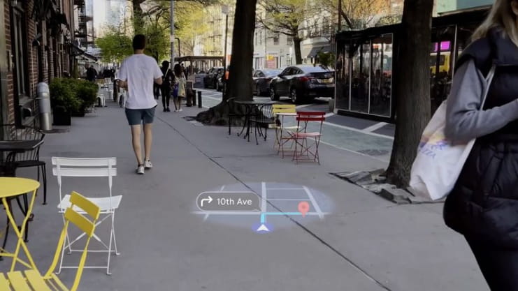
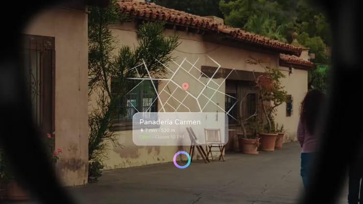
In each case, a 2D map is displayed on a flat plane in front of the user. The circular translucent map spins with your directional heading (via IMU), while disappearing and reappearing as you glance up and down – an elegant and ambient UX for urban walking. See both below.


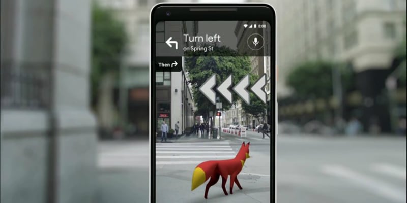
So what’s the previous generation’s comparison? You may remember Google Live View and Apple LookAround – mobile AR mapping features that guide users with 3D navigational arrows. Users hold up their phone to localize it, then follow arrows that are overlaid dimensionally.
This differs from Google and Meta’s newer approaches in that it was in 3D. Google did this by scanning your surroundings (the localization part), and matching it with the Street View database. After fixing your location, it overlaid 3D navigational arrows and even animals to guide you.

Easier Said than Done
Sticking with Google Live View and Apple LookAround, both were compelling and sexy… but largely unused. The reasons had a lot to do with a cumbersome user experience, beyond what was happening on the screen. It involved holding up one’s phone to both localize and navigate.
That, plus overheating phones and the activation energy of clicking through menus to find it, ended up stalling large-scale adoption. To many mainstream mobile users, the juice wasn’t worth the squeeze – even though the UX was technically superior to 2D mapping in urban canyons.
Stepping back, this brings us full circle to lite AR. In many cases, a simpler UX – even if graphically underpowered – could gain more traction. Put another way, it’s about designing things that are experientially superior, even if graphically inferior – easier said than done of course.
If we compare Google Live View with its newer Android XR mapping UX, the former is in 3D while the latter is 2D. The 2D approach is inferior on technical levels, but more user-friendly and aligned with familiar formats. It requires less activation energy and learning curves.
Of course, we don’t know yet if Google and Meta’s newer headworn navigational UX will land with consumers. But it does appear to be more ambient, intelligent, and elegant. The answer will be, as always, determined by the market. So we’ll be waiting eagerly to see how it lands.
