Shoppability is the new black. There’s a trend towards all things being shoppable. We’re talking buy buttons on everything from YouTube videos to Instagram Stories. This isn’t necessarily a new phenomenon but is one of many trends that’s been Covid-accelerated.
Elsewhere – and for similar reasons – we see a separate trend: visual commerce. This includes product visualization and visual search. The former lets you try on everything from shoes to lipstick to couches using AR lenses. The latter identifies things you point your phone at.
Panning back, these trends – shoppability and visual commerce – are on a collision course. Point your phone at a jacket a friend is wearing using Google Lens or Snap Scan, then buy it right on the spot. It compresses the purchase funnel through a visually-informed decision flow.
All of the above is underway, but there’s a ways to go in capability and cultural acclimation. Accelerating things are the self-motivated efforts of tech giants to future-proof their core businesses. This is the theme of our AR and Shopping Collide series, continuing here with Houzz.
View in My Room
One company that’s received considerable accolades for AR commerce is Houzz. The home furnishings company offers AR to visualize products prior to purchasing. And its 11x boost in conversions from AR visualization is one of AR’s most cited data points.
But how did it get there? This all started as a 2D version of its now popular AR View in My Room feature. It used flat stickers for in-room furniture visualization. Though primitive, Houzz operational scale gave it large-sample demand signals by which to test and iterate features.
With just that 2D sticker, Houzz saw a 3x boost in conversions. This was enough to get it thinking about more spatially-advanced integrations. Notably, this was before Apple’s ARkit so like other AR pioneers at the time, it had to do lots of in-house development.
Fast forward several product cycles later, and Houzz was ready to hit the ground running when ARCore and ARkit were released in 2017. It was able to take all the work it did and integrate these new native libraries for better functionality like tracking, scale, and light estimation.
More importantly, all that feature evolution taught Houzz an important lesson: AR needs to be in the shopping flow. It found through large-scale testing that AR features placed within users’ shopping path – or what we call “AR as a Feature” – outperform standalone AR apps.
B2B2C
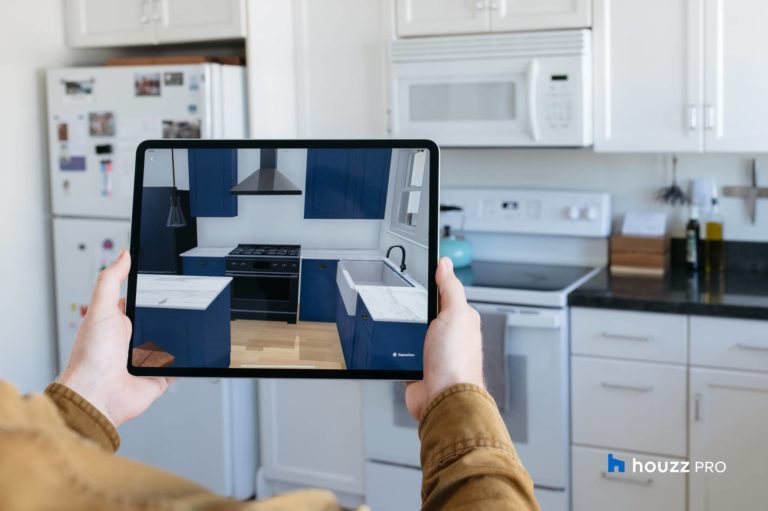
Doubling down on all of the above, Houzz recently took steps towards more holistic AR experiences. Instead of just letting consumers virtually place individual items in their space through AR, why not transform entire rooms? Its new home renovation feature does just that.
Meant to empower designers and home renovation pros, it lets them break out their iPads when meeting with homeowners to visualize finished jobs. They can make design choices on the fly, then apply them live to AR-powered mockups and visualize those variations on-site.
Panning back, this accomplishes a few things. First, it broadens AR visualization. The technology has become popular for visualizing individual items, a la View in My Room. Houzz now positions AR to tackle entire renovation projects by visualizing final results on a room-by-room basis.
The second thing this accomplishes for Houzz is “B2B2C”: a more accelerated path to consumer adoption through businesses that serve them. Those businesses are motivated adopters in that AR can give them a competitive edge and avoid downstream headaches like redoing work.
In other words, pros are better off with more informed and confident customer choices. This is analogous to AR’s ability to reduce product returns in eCommerce because of more confident choices. Home renovation pros could benefit from a higher-stakes version of that.
Organic & Additive
So what are the lessons for building AR shopping features? Houzz got to where it is by practicing iterative product cycles, following usage data, and reducing friction by integrating AR into the existing shopping flow. It also created a back door to consumer adoption via B2B2C.
Another important tactic is to make AR intuitive. ARkit and ARCore provide a great foundation. But it’s just that: Some degree of customization is needed for optimal UX in specific product classes (think: couches versus flooring) which is a good lesson for any AR-curious retailers.
AR should also be easy to find, as users aren’t yet asking for it or going out of their way. As examined last week in light of Instagram, AR sees the most success when placed directly in users’ paths. It should also be integrated in ways that align with users’ comfort and cognition.
For example, with the transactional functionalities for AR visualization and shopping, the entire purchase funnel should happen all in one flow. It shouldn’t bounce users to another app or website to further browse products and transact. It should all happen in one place.
All of this is important in AR’s early stages of consumer adoption when it isn’t yet proven enough to compel users to look for it or work for it. That means meet them halfway by integrating AR in sparing ways that are organic and additive to the things they’re already comfortable with.

