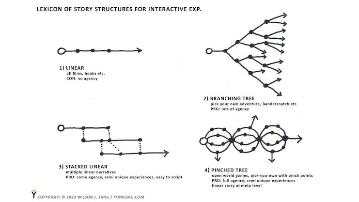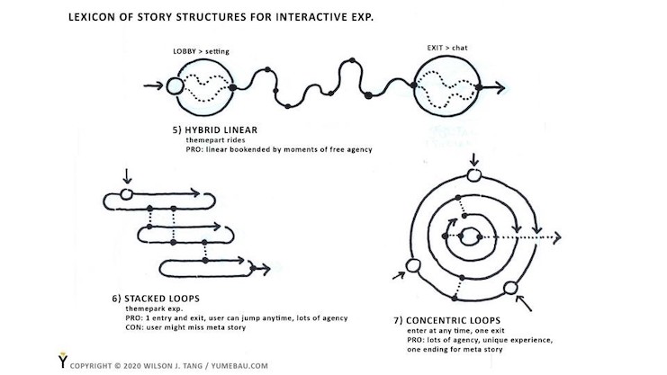
Last year, I had a chance to speak on a panel about narrative forms at the VR/AR Global Summit. Every time I get invited to talk, it gives me a chance to reflect on things from a slightly different perspective. In a weird coincidence, I had dug up some old sketches from more than 2 decades ago in which I was just starting to think about the “shape” of narrative structures as they related to games — a medium that I was struggling to wrap my mind around as I left behind the static world of architecture.
As some folks at the panel seemed interested in these “shapes” (which are by no means exhaustive) I want to share them here along with some thoughts on what they might mean for anyone involved in the design of AR/VR experiences, as well as provide a glimpse into how our company approaches design for our mobile AR platform YumeGo.
Both AR and VR (which are often spoken of interchangeably ) are barely in the initial gee-whiz phase of their development as art forms. Similar to all of the other mediums that preceded AR/VR: aural, books, radio, tv, cinema etc., AR and VR has started out in the “gee-whiz” stage, in which the novel experience of the content itself was compelling enough to captivate the audience (think “War of the Worlds” radio play that caused widespread panic, or the “Speeding Train” by the Lumiere Brothers which caused early cinema-goers to jump back in fright).
The initial wonderment of all new mediums eventually leads to the “normalization” phase in which the viewer is no longer “wowed” by the novelty of the medium itself, but instead must be presented with well-crafted and cleverly structured content to be drawn into and kept inside the experience.
Once AR/VR evolves beyond the current state of novelty, it will also need to come up with well-crafted and cleverly structured experiences to keep people interested. What forms will these experiences take?
Let’s start by thinking about the “UX” of older media, or how users experienced older content: nomadic peoples gathered by the campfire listening to the village elders tell stories of gods and demons; ancient Greek audiences seated at monumental open-air theatres watching Greek tragedies unfold on stage; home audiences during the golden age of television tuning in to watch sitcoms or variety shows; modern audiences binge-watching entire season’s worth of shows on Netflix.
In all of the above cases, the goal of keeping audiences captivated enough to stay and watch the content in its entirety pushed the storyteller to constantly reinvent their creative strategies, with each new medium necessitating a new form. For example, the art of film co-evolved with the business of cinemas until the UX converged into the form that we have today — a three-act structure that on average fit into a 90 to 120-minute linear narrative (following such formulas as the “Skin the Cat” which gave audiences a perfectly fulfilling sense of suspense and completion within those 90 to 120 minutes).
Forms co-evolve with new business models to support those forms — take television, for example, which obviously descended from cinema but with the key difference that it was cheap enough to be in every home on earth and needed content 24/7. The UX of TV necessitates a slightly different business model than film: free-to-watch but financed by subjecting the home audience to regular bursts of advertising.
The form of the content converged into roughly 22 minutes of show offset by about 8 minutes of advertising (ostensibly because over the course of its evolution the executives discovered that 7 minutes wasn’t enough to maximize profits and 9 minutes was too much for most short attention-spanned audiences to bear?). Over time, the form converged into genres epitomized by sitcoms and variety shows: short bursts of humor or music interspersed with week after week of roughly the same storylines with minor variation — perfect for creating regular weekly audiences with predictable viewership and therefore predictable revenues.
In recent times, video games have risen to dominance as a pastime and a business, resulting in a medium that has finally evolved beyond being Completely Passive. Contemporary console game controllers are sophisticated (and complicated) peripherals designed to give gamers the illusion of full control while physically seated — ie. mostly passive except for their hands. I’ll leave it to another time to discuss the co-evolution of different business models to support the different formats of games.
What is important to understand is that in terms of User Experience (UX) that all of these different types of content, from storytelling by the campfire to playing PS2 on the couch, were all designed to be enjoyed while seated. In other words, the UX of all mediums up to the introduction of AR/VR was directed at an immobile viewer, preferably seated for a pre-determined duration.
What makes the age of AR/VR unique is not the 360-degree visual immersion, nor is it the novelty of placing virtual people or objects into the world — both sets of technologies merely provide the foundation. What makes it so full of potential is the convergence of software and hardware innovations that will give the user full-body “agency” in the virtual realm. Specifically, natural body expression and interaction with no cumbersome tracking hardware or post-processing (both of which have been used extensively as motion capture in the film industry).
In order words, AR/VR is not just another medium per se, it is a place for doing – with things to interact with that happens to be made of pixels and code rather than plastic and steel. For those of us working in the space, it is important to remember that those who “go” to a VR experience are not “viewers” — for that implies passive consumption, nor are they “players” — for that implies a very specific and confining genre of activities. Those who “go” to a VR experience are “visitors” or “employees” or “shoppers” or “competitors”…. in other words, the full gamut of activities available for people to do in the real world.
Unlike ALL the other mediums before it, the experience of AR/VR will be fundamentally different because of its UX. I’m not referring to the micro-level UX within the device or apps, but at the meta-level, the user’s body is the UX. That freedom of full-body movement, which we are just starting to experience on devices such as the Oculus Quest 2, will initiate a process of co-evolution between artistic forms and business models just like all the major new mediums before. What forms will dominate will be anyone’s guess, but one thing is for sure — it will not be linear, and it will not be like those passive mediums of the past.
The following diagrams are tools for me (and hopefully you too) to think about how experiences can be structured when the user has full freedom of movement. In a way, that is why narrative 360 VR was destined to fail — it was the form and message of another medium shoehorned into an early and extremely limited form of VR, one in which the user had freedom to look in any direction but not much else.
Of course, I would love to hear from those of you who can provide other examples of “experiential structures” to help all of us practitioners in conceptualizing, structuring, and developing the design of this new reality.


 Wilson J. Tang is CEO and Chief Designer of YumeGo.

