

XR Talks is a series that features the best presentations and educational videos from the XR universe. It includes embedded video, as well as narrative analysis and top takeaways. Speakers’ opinions are their own.
One of the most anticipated and potentially-useful forms of AR has been Google’s VPS walking directions. But its lesser-known backstory likewise offers value in the form of lessons for AR interaction design. Google broke this down at its I/O event in May (video below).
“Our vision-based approach works similar to how humans orient and navigate — by recognizing familiar features and landmarks,” said Google’s Joanna Kim. “Solving this has been one of the most technically-challenging projects that I’ve been a part of during my eight years at Google.”
Continuing the discussion from where we left off last week in part I, how did Google go about refining the product? After conceptualizing VPS by utilizing a combination of smartphone GPS, IMU, camera and Street View (image database), the next step is interface design.
“The core technology doesn’t do any good without being presented to the user in the right way,” said Google’s Jeremy Pack. “When using [VPS] we are walking down a busy street, and need to get there safely. We want our smartphone to surface the right information in the way we need it.”
This involved rapid prototyping, iterating on various user interactions and processing user feedback — all things that Google is uniquely positioned for. So it cycled through more than 120 prototype variants, including the famous (but now shelved) fox guide from Google I/O 2018.
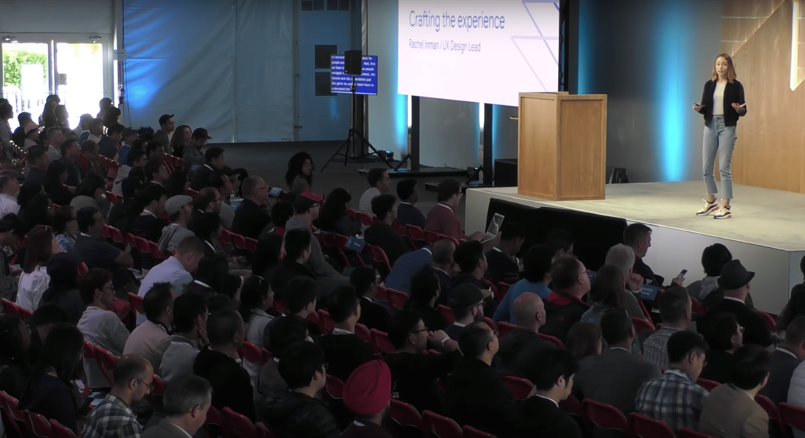
“If developing a new technical approach using VPS plus Street View wasn’t complex enough, we also had to dive into a totally new area of interaction design,” said Google’s Rachel Inman. “There’s no spec site [we] can pull up to understand how to design for outdoor, world-scale AR.”
From this process, the VPS team learned a few key lessons that can be valuable to anyone working on AR interaction design — especially for outdoor experiences or anything involving navigation (a potentially big AR category). For example, guiding users’ focus is a key tactic.
This involves avoiding clutter and information overload, which doesn’t play well on a small screen. But moreover, the experience of navigating involves urgency and immediacy, so prioritize directional signals and final destination, as opposed to lots of points of interest along the way.
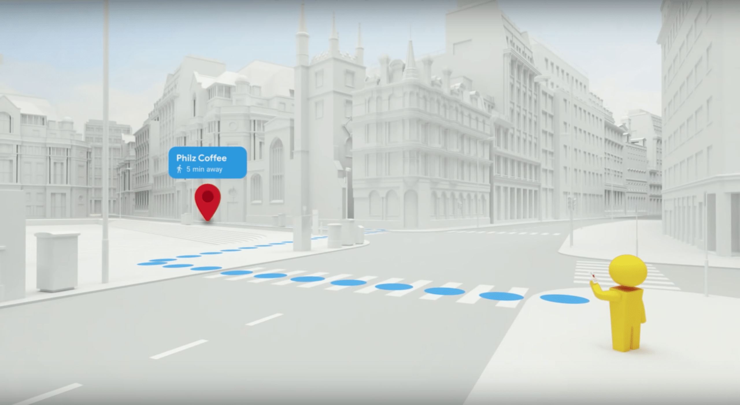
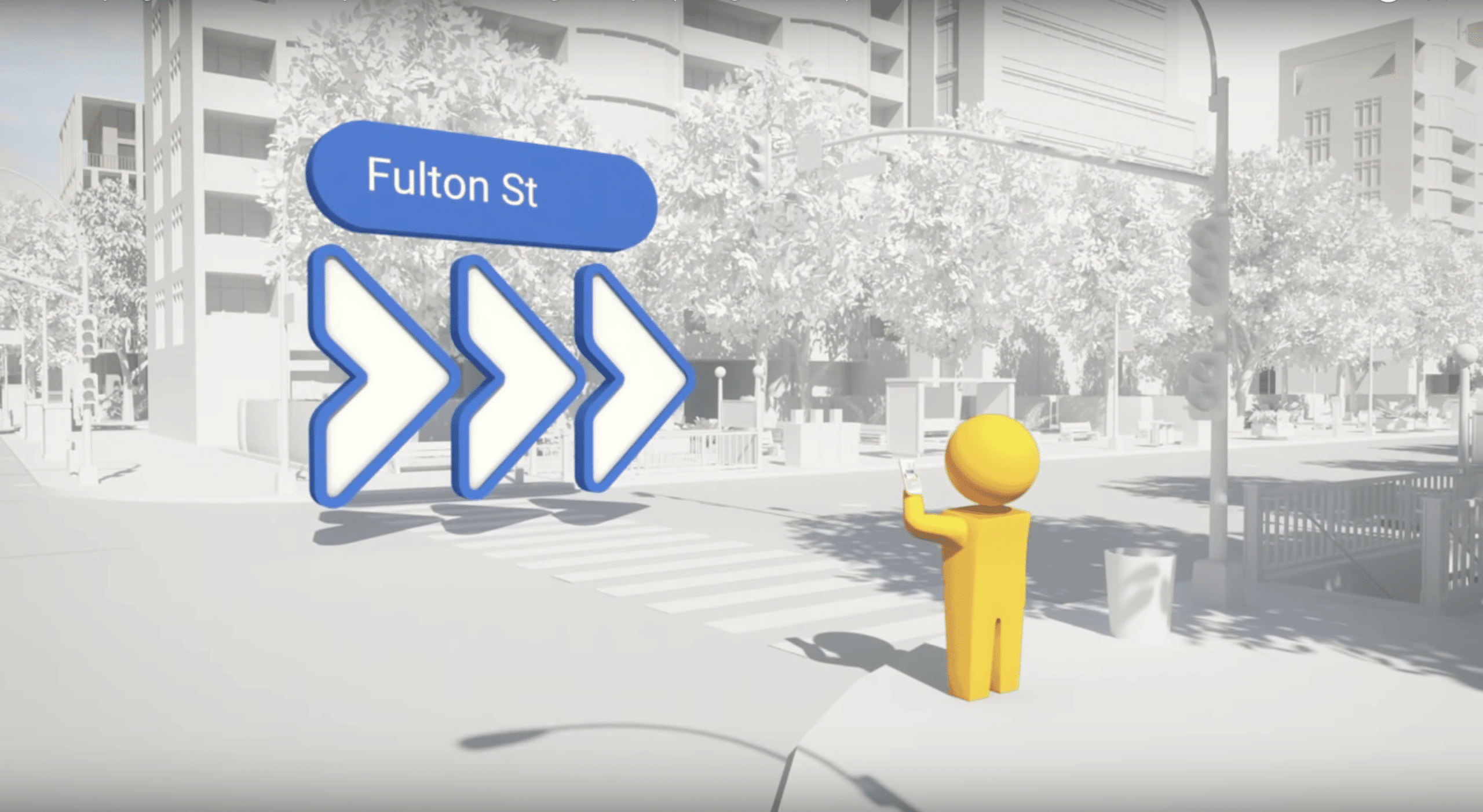
The second lesson is to keep things “grounded and glanceable.” Though AR’s main point is to infuse graphics with the real world, navigational interfaces shouldn’t blend in too much (as an AR game might) This can be seen in VPS colorful and prominent directional arrows (see below).
“We needed to strike a certain visual balance,” said Inman. “The AR objects need to stand out from their surroundings, but also be placed in a particular location to provide maximum clarity to users. So show me exactly where that turn is, but stand out from the real world.”
The third big lesson is to leverage the familiar. We’ve been conditioned to specific graphics in navigation apps like Google Maps (think: red destination pin, blue callouts for turns). Though the aforementioned fox guide is cute and novel, it was too much of a departure from the familiar.
“If we had reinvented how we presented information in AR [with] a new visual metaphor, people would have to get used to that new visual metaphor in addition to getting used to new interaction patterns with AR,” said Inman. “And that would have been a lot to ask people.”
Finally, The VPS team suggests keeping experiences short and assistive. Though the mobile media playbook is to increase engagement, the AR playbook more about short “snacking” sessions, due to battery drain and arm fatigue. That means design for quick interactions.
Beyond that general AR lesson, it especially applies to navigation. It’s a safety risk to motivate unsafe behavior such as holding up a phone while crossing the street. This is baked into VPS with features that prompt users to put the phone down for the majority of their guided walk.
“We all envisioned an AR mode where users would start and end their journey, all while using the camera,” said Kim. “But as we continued to develop, we realized this was actually a really bad idea… They don’t really need AR just to know that they need to walk five minutes straight.”
Altogether, it’s a valuable set of lessons from a team that spent lots of time designing the optimal UX. Breaking down those learnings is a gift to the rest of the industry, especially those in the process of UX design. It’s what the AR industry needs at this early and experimental stage.
“It’s not a comprehensive list, but they’re all things that we had to learn the hard way, so we hope that you enjoy them,” said Kim. “Because we had to fail a lot of times to actually get to this.”
See the full presentation below and see part I of this series here.
For deeper XR data and intelligence, join ARtillery PRO and subscribe to the free AR Insider Weekly newsletter.
Disclosure: AR Insider has no financial stake in the companies mentioned in this post, nor received payment for its production. Disclosure and ethics policy can be seen here.
Header image credit: Google